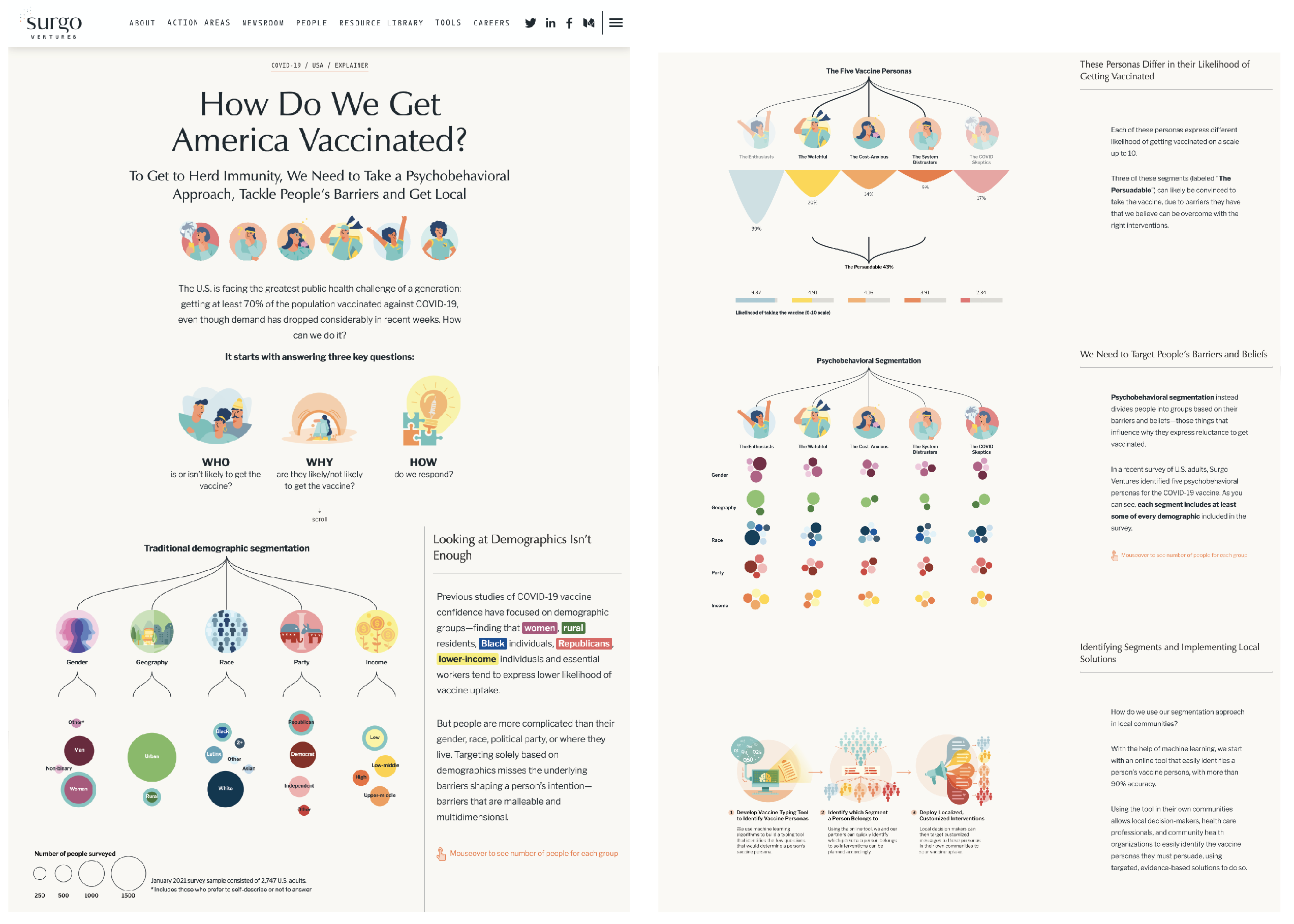
Go to the interactive story “How Do We Get America Vaccinated? “
The interactive is a collaboration with dataviz developer, Julia Janicki. It was awarded the “award of excellence” by the society of news design 43.

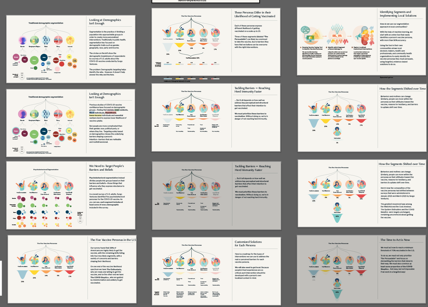
This was a data-driven visual explainer detailing what “psychobehavioral segmentation” is and how we can use this approach to drive vaccine uptake. Rather than just looking at demographics, the approach divides people into segments (personas) based on their behaviors, motivations, and beliefs, which allows us to understand individual’s unique barriers and develop targeted solutions.
The explainer was able to distill a complex technique, commonly used in marketing but not as well known in public health, to something easily digestible to the public and decision makers. It was also extremely timely given that we applied the approach and provided suggested solutions at a time when vaccine uptake in the U.S. was plateauing.
Creative Process
I thought of using our rich nationally representative survey data of 2,747 U.S. adults as the backbone of the visual explainer in order to provide research-backed evidence and a relatable example.
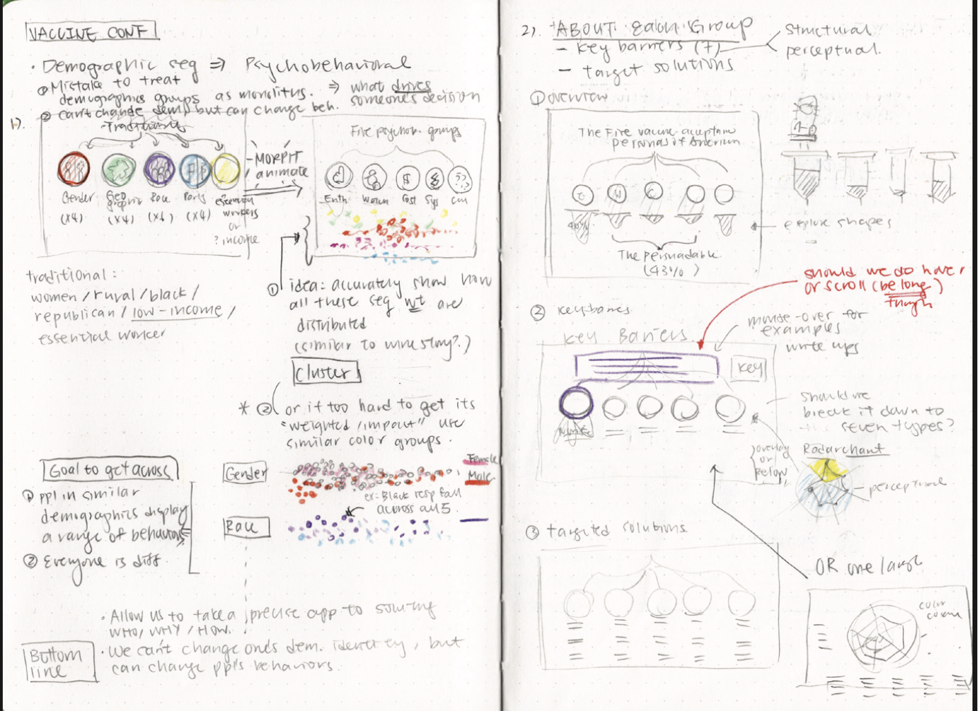
I then developed sketches and storyboards and brainstormed how to best visualize the data. We decided that D3 animated circles can best show how each segment, when created based on people’s barriers and beliefs, includes at least some of every demographic, demonstrating that targeting demographics alone is not enough.


Due to a tight timeline and the urgency of the matter, I learned to balance and prioritize what is crucial to driving immediate impact, and what can be compromised to work efficiently. For us, it was important to not compromise the quality of the data analysis, reporting, and our core message, but I opted for a more simple graphic design aesthetic so that it won’t take as much time and can be more adjustable. Even though it was still quite a challenge, we were able to create the explainer, from idea to sketch to final, in 4 weeks, with mainly just two people working on the project.
For the development, the base technologies we used include HTML, CSS and Javascript in order to build an interactive page on the web. Then we used Scrollama, a JavaScript library for scrollytelling, to set up the scroll-triggered steps. D3, a JavaScript library, was used to draw the data visualization and animation as the user scrolls.
The final project, accompanied by our full report, developed framework, and press releases, was able to provide a resource package for local decision makers to easily apply such approach to their communities to increase vaccine uptake. We also collaborated with several health orgs to develop pilot programs within their priority groups by explaining the approach with the explainer, as well as using the vaccine personas quiz developed by our data science team. Finally, we also collaborated with the New York Time on an opinion piece in order to reach a wider audience. The project won an SND award this year, a first for the small NGO!
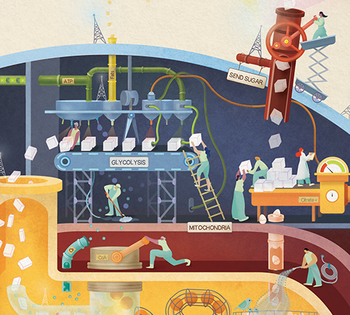
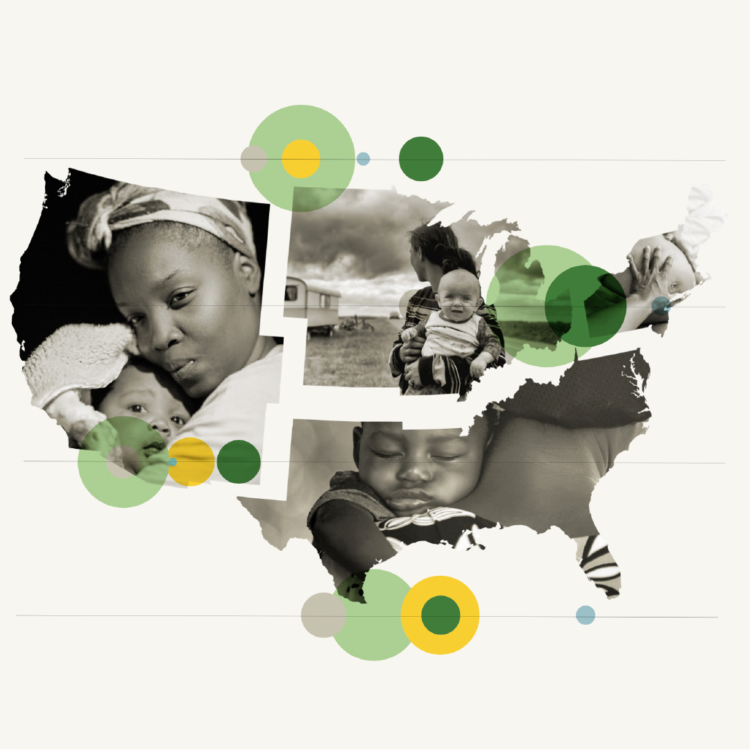
Check out my other projects!


